The Top Ten Most Awkward Keyblades
 The Keyblade is a weapon that is unique to the Kingdom Hearts series of games. The Keyblade has a wide array of abilities, one of which is to grow in strength with its user. Throughout the series, Keyblade bearers have augmented their Keyblades with Keychains, powerful talismans that change the properties and appearance of the Keyblade. In some cases, these appearances are dynamic and strong, while in other cases the weapon produced can look downright ridiculous.
Different Keyblades represent different aspects of the Kingdom Hearts series, from the worlds that the player visits to the characters you meet along the way. Some Keyblades simply don’t have strong designs, others have the right elements but they clash, and the worst offenders don’t look like weapons–or keys–at all. The following list looks at Keyblades from a purely aesthetic point of view and ranks the ugliest, most awkward looking of the bunch.
#10 – Lionheart
First Appearance: Kingdom Hearts
Rating: Lazy!
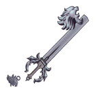
The first Kingdom Hearts featured two Keyblades designed for the guest Final Fantasy characters, Cloud and Leon (aka Squall). Metal Chocobo, the Keyblade that represents Cloud, is a perfect recreation of Cloud’s Buster Sword as a Keyblade, so naturally you would think that Leon’s Lionheart Keyblade would be a representation of his signature Gunblade. Well, you’d be wrong. The Lionheart is just Leon’s stupid little lion necklace haphazardly stuck on the end of a fairly basic piece of metal. The same symbol reappears on the keychain as well, making this a lazy design overall. I’m not sure if Lionheart was a last minute addition, but it sure looks like it was thrown together at the last minute.
#9 – Jungle Key
First Appearance: Kingdom Hearts
Rating: Rancid!
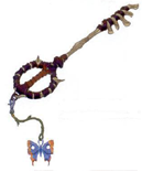
I can appreciate and admire behind the concept of the Jungle Key– it’s a Keyblade that looks like Tarzan himself might have made it from whatever he could find in the jungle. It’s just unfortunate that the only thing he could find was a bunch of nasty bones. The teeth of the Keyblade remind me of the ending to The Flintstones theme song opening where Fred orders that giant slab of ribs that ends up tipping over the car. Meanwhile, the butterfly keychain, while thematically appropriate to the Tarzan level, is aesthetically jarring. You’ve got a rotting pile of meat at the front and this precious blue butterfly at the back. It doesn’t work.
#8 – Crabclaw
 First Appearance: Kingdom Hearts
Rating: Fishy!
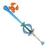
This looks more like the kind of decoration you would find in a Red Lobster than a serious weapon. The bright blue and purple color scheme is very reminiscent of The Little Mermaid– and also a little girl’s bedroom from the 90’s. The crab that represents the teeth is a creative idea, but it falls flat because there’s not much to tie it to the rest of the key. It’s a bright orange eyesore that clashes with the rest of the blade. The Crabclaw Keyblade also suffers from poor timing. You receive it immediately before your first visit to Halloween Town, and this only serves to kill the creepy dark mood of that level completely when Sora is dressed up like a ghoul and he’s carrying a colorful bath toy for a weapon.
#7 – Destiny’s Embrace
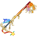 First Appearance: Kingdom Hearts II
Rating: Tacky!
In Kingdom Hearts II, Kairi is finally given her chance to shine when she’s allowed to “borrow” a Keyblade to help Riku in battle. However, the Keyblade she receives is the sickeningly sweet Destiny’s Embrace. As with the Jungle Key, I understand the concept— it’s supposed to be a Keyblade to represent Destiny Islands, and the lower half of the Keyblade drives that point home, with the water crest around the hilt and the Paopu Fruit keychain. However, the wildflowers for the teeth of the key is way too busy and almost insultingly girly. Sora and Riku run around with these amazing looking weapons, and Kairi is stuck with a bunch of pretty flowers on a stick because she’s “the girl.”
#6 – Sweet Memories
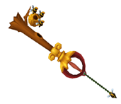 First Appearance: Kingdom Hearts II
Rating: Oh Bother!
First of all, I have an issue with getting any weapon from Winnie the Pooh– period. So, with that said, I definitely don’t want a weapon that is a constant reminder of kind, gentle Winnie the Pooh. When you can hang the Keyblade in a nursery and it doesn’t look out of place, that should be a red flag that something is wrong with the design. This Keyblade does not look like a key, not even if I squint my eyes really hard. The beehive and bees barely pass as key teeth– instead the entire thing looks like a diorama meant to describe the details of the Hundred Acre Woods level instead of being an actual, functional weapon. Sweet Memories is one of the first Keyblades to go for the diorama look and it sets a bad precedent that is carried on by other offenders on this list.
#5 – Treasure Trove
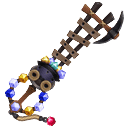 First Appearance: Kingdom Hearts: Birth by Sleep
Rating: Busy!
The Treasure Trove Keyblade really wants you to remember the Dwarves Woodland level, so much that it has become a portable version of the level itself. The problem with some of the later Keyblade designs is that they stop looking like weapons and start looking like actual scenes from the movie. It you took this Keyblade, stood it upright and asked someone unfamiliar with Kingdom Hearts what it could be I doubt many of them would know it was supposed to be a weapon, and especially not a key-themed weapon. The problem here isn’t a lack of creativity, it’s the overly-busy execution that kills the design. The jewels around the hilt and the pick-axe are smart choices, but the inclusion of an entire mine cart and tracks makes it too much for one weapon. How would anyone be able to wield this bulky thing?
#4 – Rumbling Rose
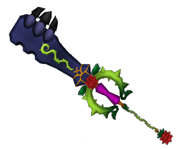 First Appearance: Kingdom Hearts II
Rating: Beastly!
In an effort to create a Keyblade that represents the “Beast” half of Beauty and the Beast the game designers apparently severed the arm of a Muppet and stuck it on a tacky hilt. Everything about this Keyblade just rubs me the wrong way. The color scheme clashes, with the dark blue contrasting the almost neon green thorns and the bright pink handle. To make matters even worse, the rose design incorporated into the Keyblade is not actually a rose upon further inspection–it’s a red geometric pattern made from staggered diamonds. I have a feeling that even Sora hates this Keyblade, considering there are thorns inside the hilt where he puts his hand.
#3 – Gull Wing
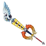 First Appearance: Kingdom Hearts II
Rating: Fowl!
If it wasn’t weird enough that Yuna, Rikku and Payne from Final Fantasy X-2 have been turned into tiny fairies for the Kingdom Hearts series, the Keyblade they give Sora is a hot mess. I like the idea of using a bird wing for the teeth of the key, but the giant bug-eyed seagull has to go. The Gull Wing Keyblade attempts to invoke elements from each character in the trio, but throws them together in the worse way possible. The hideous yellow bows looked a lot better on Rikku than as the blade of the weapon. On the other hand, Yuna’s ugly rat-tail accessory looks better as a keychain than a hairstyle choice, however I can’t help but thinking it might actually be made from her hair. There aren’t many elements of Payne’s costume in the design of the Keyblade, but considering how much of a mess it already is, that might be for the best.
#2 – Victory Line
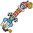 First Appearance: Kingdom Hearts: Birth by Sleep
Rating: Car Wreck!
Did you like the Rumble Racing minigame? Well, good news! Completing it gives you this souvenir called Victory Line. No, that not a child’s toy, that’s an actual Keyblade–even though it doesn’t look a thing like a key or a blade. Of all the Keyblades that could be mistaken for a diorama, this is the worst offender. While other Keyblades opt for designs that merely remind you of the world they came from, Victory Line’s design hits you over the head by having a body made up of an entire building from that world. The gear key stuck to the top of the clock tower is a paltry excuse for key teeth, which prevents the thing from ever really looking like a proper Keyblade.
#1 – Sweetstack
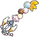 First Appearance: Kingdom Hearts: Birth by Sleep
Rating: Saccharine!
The design of the Sweetstack Keyblade is so bad, it makes me question the logic behind the very idea of a Keyblade. This is supposed to be one of the most powerful weapons in existence, correct? Then why would it ever look like a big messy pile of assorted ice cream? How can you ever take someone holding this thing seriously? I question the stability of a pile of ice cream to begin with, but the haphazard way they are stacked makes it look utterly clumsy. The three orange slices on top for the teeth are kind of a weird inclusion for a bowl of ice cream and they don’t do a good job of representing teeth. It would be bad enough if this was just a joke Keyblade, but the Sweetstack has the ability to perform a critical hit EVERY TIME you use it. The most ridiculous looking Keyblade in all of existence is also one of the most powerful.
With so many Keyblades over the years, there have been plenty of hits and misses and your opinion may vary from my own. However the Kingdom Hearts series reminds us that you can’t judge a book by its cover, or a Keyblade by its design. No matter how ridiculous a Keyblade might look, it is still something to behold when properly utilized in combat. Next week, we’ll take a look at the Keyblade designs that get it right and count down the top ten best-looking Keyblades.
 Kris Moore is a professional writer from Detroit, Michigan and a longtime Kingdom Hearts fan. When he’s not playing video games, Kris can be found writing comics for the ongoing comic series “Science Girl.” You can read more of his work at ScienceGirlComics.com.

