Awesome-Looking Keyblades at a Glance
Last week I counted down “The Top Ten Most Awkward Looking Keyblades”, which proved to be an easier task than trying to find the top ten best-looking Keyblades. It’s easy to look at something and have a negative reaction to it—it’s much harder to play favorites in a sea of possible choices.
When I started narrowing down Keyblades for this article, I had 30 that I absolutely loved, so I had to make a lot of intense Sophie’s Choice moments. Ultimately, I had to be strict and break it down into a few rules:
1. The Keyblade has to look like a key. Obviously since the designers at Square-Enix are lax about this particular design element I had to leave some wiggle room, but it has to have a strong enough key-like quality to pass the test.
2. The Keyblade has to look like a weapon, not like a pile of ice cream, a stick with a beehive on it or a diorama of the level itself.
3. The Keyblade has to aptly sum up the level, character or theme that the design is based upon. It can’t be too generic or lacking a central theme.
4. The Keyblade shouldn’t have too many of the negative qualities that I mentioned in the previous article. Meaning, if I gave one Keyblade flak about something, I couldn’t be a hypocrite and let another Keyblade have a pass.
With the rules in place I had to eliminate a few designs that I personally liked, but that broke too many rules to qualify for the list. Sacrifices had to be made and in the end I feel the justifications I’ve made for the top ten are valid. However, this is just one person’s opinion and your own “best” list may vary.
#10. Hidden Dragon
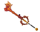 First Appearance: Kingdom Hearts II
Rating: Smokin’!
Maybe I’m just a sucker for anything red and scaly, but this fire-breathing Keyblade is scorchin’ hot. The Mushu head design is both fierce and bold, yet simple enough that it doesn’t look like Sora’s carrying around a big dragon head. The plumes of fire coming out of the head of the dragon that make up the blade and key teeth look powerful, yet it’s delicate enough to be an ornate key used in Ancient China. What I like most about the Keyblade is that it manages to pull off a distinctly Chinese feel with the gold accents, but it doesn’t go overboard with the Asian flourishes.
#9. Monochrome
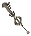 First Appearance: Kingdom Hearts II
Rating: Moxy!
The black-and-white Monochrome Keyblade is a blast from the past that perfectly encapsulates the Timeless River level. From afar you see a typical Keyblade, but upon closer inspection the weapon is made up of a hodge-podge of different steamboat items, held together by nautical rope. It reminds me of the kind of Keyblade Mickey Mouse might have made in an old Disney serial from whatever he could get his hands on. The life preserver around the hilt and the steam engine keys are great visual contrasts, but I think I like the handle being made completely from rope the most.
#8. Wishing Lamp
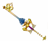 First Appearance: Kingdom Hearts II
Rating: Magical!
Whereas the first Keyblade from Agrabah, Three Wishes, focused on the desert landscape, Wishing Lamp really places its focus on the iconic sultan’s palace. The Keyblade looks almost like a totem pole of different movie elements, with the hilt looking like the walls around the palace, leading up to a decorative oil lamp. The blue fleur de lis coming out of the lamp resembles peacock feathers and the magic of the Genie. The fade from blue magic to white palace tower represents Aladdin’s wish to become royalty and the additional fleur de lis adds to the regal feeling of the blade and gives it a key-like quality.
#7. Circle of Life
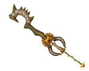 First Appearance: Kingdom Hearts II
Rating: Predatory!
In the last article I complimented the Jungle King’s idea of a Keyblade made from items found in the brush, but I didn’t think that particular weapon pulled it off. Circle of Life is the perfect example of a primal Keyblade done right. The spiked stick used to create the teeth and blade of the key make this weapon look like one deadly club. I love the use of the young Simba head for the keychain because if you follow it up to the hilt you have the design of a full grown lion, signifying Simba’s maturity. I absolutely love all of the tribal designs painted on the weapon, but I especially love the use of wildebeest horns around the hilt. It’s not something that’s immediately noticed, but considering the Keyblade is named Circle of Life, it’s befitting.
#6. Follow the Wind
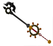 First Appearance: Kingdom Hearts II
Rating: Savvy!
The Keyblade of the Port Royal level has a subdued, streamlined look to match that world’s live-action look. There are many nautical elements at play here, but they take on a much darker nature than the other nautical-themed Keyblade, Monochrome. The key teeth made from an anchor is a thematic choice that actually makes this look more like an actual weapon. Around the hilt is a design reminiscent of a ship’s port hole, wrapped in a nautical rope, with the handles of a ship’s steering wheel surrounding the exterior. Even the tip of this Keyblade resembles the arrow of a nautical compass. The use of the cursed Aztec coin for the keychain is the perfect reminder of Pirates of the Caribbean, although I have to wonder why it doesn’t make Sora a zombie in the moonlight.
#5. Two Become One
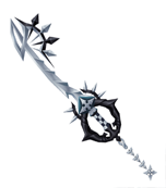 First Appearance: Kingdom Hearts II: Final Mix
Rating: It Rox!
Two Become One is the Keyblade that represents Roxas and his dual nature of both light and dark as someone inbetween, where the two elements become one. This Keyblade actually looks like a sword that was bent into a key shape at the time of its creation. The stark black and white color scheme reminds you of Roxas’ attire, especially the checkerboard hilt which looks like his armband. I really like the dark, demonic hilt with the spiked white halo at the top, really playing on the dual nature theme. The key teeth, hilt design and keychain are all symbols used by the Nobodies and really finish off the Keyblade’s overall design.
#4. Zero-One
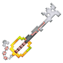 First Appearance: Kingdom Hearts Re:Coded
Rating: Retro!
A Keyblade for the 8-Bit generation, Zero-One would look right at home as a block in Tetris or a ship in Space Invaders. In fact, the key teeth portion somewhat resembles a spaceship or other creature from the age of Atari. I agree with the game designers on this one—if you’re going to go for a Keyblade made completely of data, the best idea visually is to make it out of big blocky pixels. However, Zero-One not only looks like it’s made from data, the red accents running through the blade are reminiscent of the red data blocks from Kingdom Hearts Re: Coded, tying the theme of this Keyblade to the game itself. The Keyblade itself resembles a pixilated Kingdom Key, bringing the weapon back to its roots but at the same time making its own statement.
#3. Fenrir
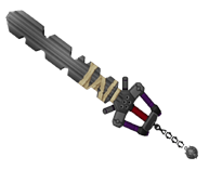 First Appearance: Kingdom Hearts II
Rating: Contemporary!
At first you don’t even want to consider a Keyblade like Fenrir because it just looks like a big sword—however the key-shape is still present, just in another form. Fenrir looks more modern, like the kind of key you would use to start a car or motorcycle, which is befitting since it’s named after Cloud’s motorcycle. The overall Cloud motif is present from the wolf-symbol keychain to the hilt, which looks a lot like his armor from Final Fantasy VII: Advent Children. Although it’s not your typical Keyblade design, I became obsessed with the idea of it when I first played through Kingdom Hearts II, to the point where I’d secretly jab at the air with my car keys when nobody was looking. A modern key for a modern interpretation of Cloud—I can dig it.
#2. Way to the Dawn
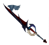 First Appearance: Kingdom Hearts II
Rating: Evolutionary!
The Way to the Dawn is the natural progression from Riku’s Soul Eater weapon into Keyblade form. This Keyblade beautifully sums up Riku’s dark nature while alluding to his new path towards redemption. The curved blade of the Soul Eater is now straightened, much like Riku’s own path has now been straightened-out. The Heartless emblem keychain has no X-shape in the middle of it, indicating Riku’s Heartless past and his newfound wholeness. The angel wing for the key teeth is a nice touch, as is the dual dark and light wings for the hilt. Plus, it still has that creepy blue eye, and I really love that.
#1. Kingdom Key/Kingdom Key D
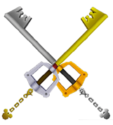 First Appearance: Kingdom Hearts
Rating: Classic!
This is the Keyblade to which all Keyblades should aspire – the elegant, timeless Kingdom Key. Although simplistic and essentially your starter Keyblade, you never forget your first. The Kingdom Key looks like the type of key that would open a door in the Magic Kingdom with its Mickey Mouse keychain and bright yellow hilt. However, the Kingdom Key also represents Sora, with his crown necklace insignia cleverly placed within the teeth of the key. I have to admit, it took me a few years before I noticed that the key teeth were in a crown shape—but that’s just a testament to how much like an actual key this weapon looks. I’m including Kingdom Key D in this rating because it’s essentially the same weapon with a reverse color scheme. It’s gold plated color scheme is a regal fit for King Mickey and I have to say I’m a little partial to the gold look myself.
 Kris Moore is a professional writer from Detroit, Michigan and a longtime Kingdom Hearts fan. When he’s not playing video games, Kris can be found writing comics for the ongoing comic series “Science Girl.” You can read more of his work at ScienceGirlComics.com.
